ESPORTS VIDEO SERVICE - WEB REDESIGN
SITUATION
Early in 2019, Activision Blizzard laid off 8% of their staff which meant our Major League Gaming / Media Network group lost designers and engineers. We were left with a lot of ambiguity in what direction we should place our next bet and leaned on our small group of passionate experts. Our design team rallied to drive the video platform vision forward, in service of Activision Blizzard esports fans. There was potential in MLG.com that had yet to be realized.
Input: Hackathon Winner
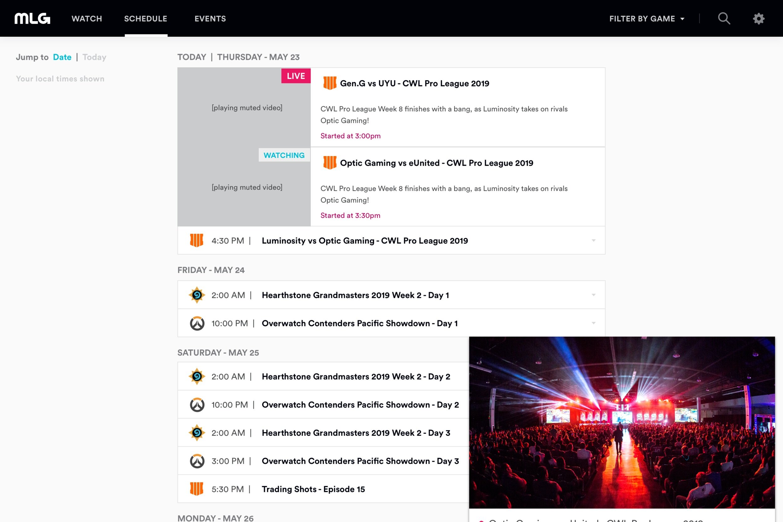
At the end of 2018, I facilitated an “Ideathon” in which cross discipline teams selected ideas from a list generated by the group. The teams worked to create prototypes against each idea and presented back to the group who voted on which project should be delivered to our customers. The winning team presented a website refresh which included a playing hero, game filters, playing hover states, editorialized feature layouts and a lean back multi-device experience.
This prototype proved to be a useful proof of concept once the redesign effort began in earnest.
Ideation
The design team, in partnership with a front end developer, worked to define a vision concept to share with the rest of the team, and stakeholders. We ran a week of ideation meetings that included whiteboard sessions, solo work and show & tells. This allowed us to share and disseminate the output from design research, our primary customer problems.
OUTPUT
Vision statement, project principles & goals
Vision feature matrix
Modular component system overview
“Video Everywhere” concept & viewing modes (standard, augmented, mini)
Site architecture overview
Vision Statement
We sit at the crossroads of two immersive entertainment experiences: playing games and watching esports.
Let’s build a watch destination as great as our games, a home that feels like part of the Activision Blizzard family.
Design Principles
Create the opportunity for viewers to become fans.
Design a platform that highlights celebration through storytelling.
Less Bootstrap, more Blizzard.
Product Goals
Build a foundation upon which we can iterate towards a deeper, more differentiated viewing experience.
Increase viewer engagement: all paths lead to video.
Project Goals & KPIs
We used our vision, principles and goals to inspire the team and guide our design decisions. We continued to come back to these later in the project when the development team would ask us how we wanted to cut scope.
Working with the Marketing team, who owned analytics, we defined KPIs based on the data from our biggest event months.
Visualize & Share
The artifacts from the ideation sessions served to guide the team as we divided up the sections of the site. Our feature matrix allowed us to start conversations with the engineering team about how we could accomplish the feature ideas we outlined. Simultaneously, the matrix served as a guidepost for what we wanted show and fed into the user journeys we outlined.
We designed against 5 use cases and presented to our main stakeholders.
Take The Vision to Reality
After gathering feedback from engineering, product and all other stakeholders, we went back and defined what we wanted out of phase 1. We narrowed our focus around our principles and goals and took a hard look at our backend data inputs (ie. those rosters are going to be tough).
Even though we recalibrated around a smaller feature set and simpler architecture, there were still items that were cut from scope during the design phase and during the implementation phase. These decisions had varying affects on the outcome of the product, which I will touch on in the user testing part of this story.
The design team hit the ground running on the phase 1 work. UX architecture and wireframe documentation lead UI deliveries in most cases, however the UI designers were able to carve out parts of the site that did not have many UX dependencies and work in tandem.
Our development team worked in 2 week sprints, so after defining the chunks of work we set up bi-weekly meetings with engineering, and one-offs as needed. The front end developer we worked with on this project also presented POCs alongside our flat designs.
As the project progressed, there was a natural shift from design sharing to engineering sharing demos and staging links. Design attended grooming and sprint planning sessions, making updates or adding clarification to tickets as needed.
Abstract for Delivery
Our team used the Abstract tool to deliver both UX & UI documentation. The ability to annotate, present designs and collect feedback in a single tool that also provides redlines and icon exports made collaboration much easier than on past projects where different methods where tried.
At the end of this project, design ran a post mortem with engineering specifically around how to better develop our delivery process using Abstract which lead the team to making better use of cover pages and collection notes.
What We Built
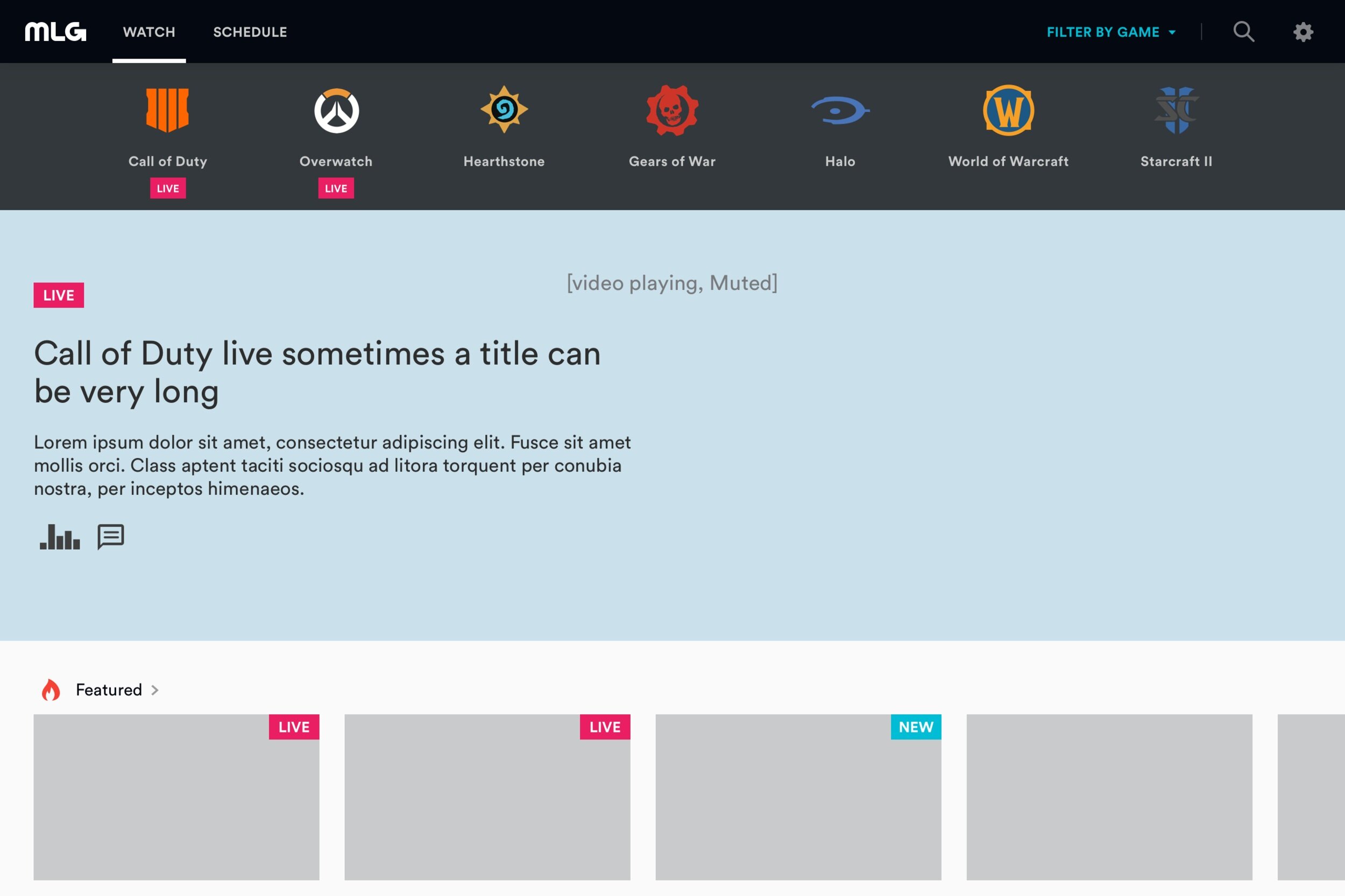
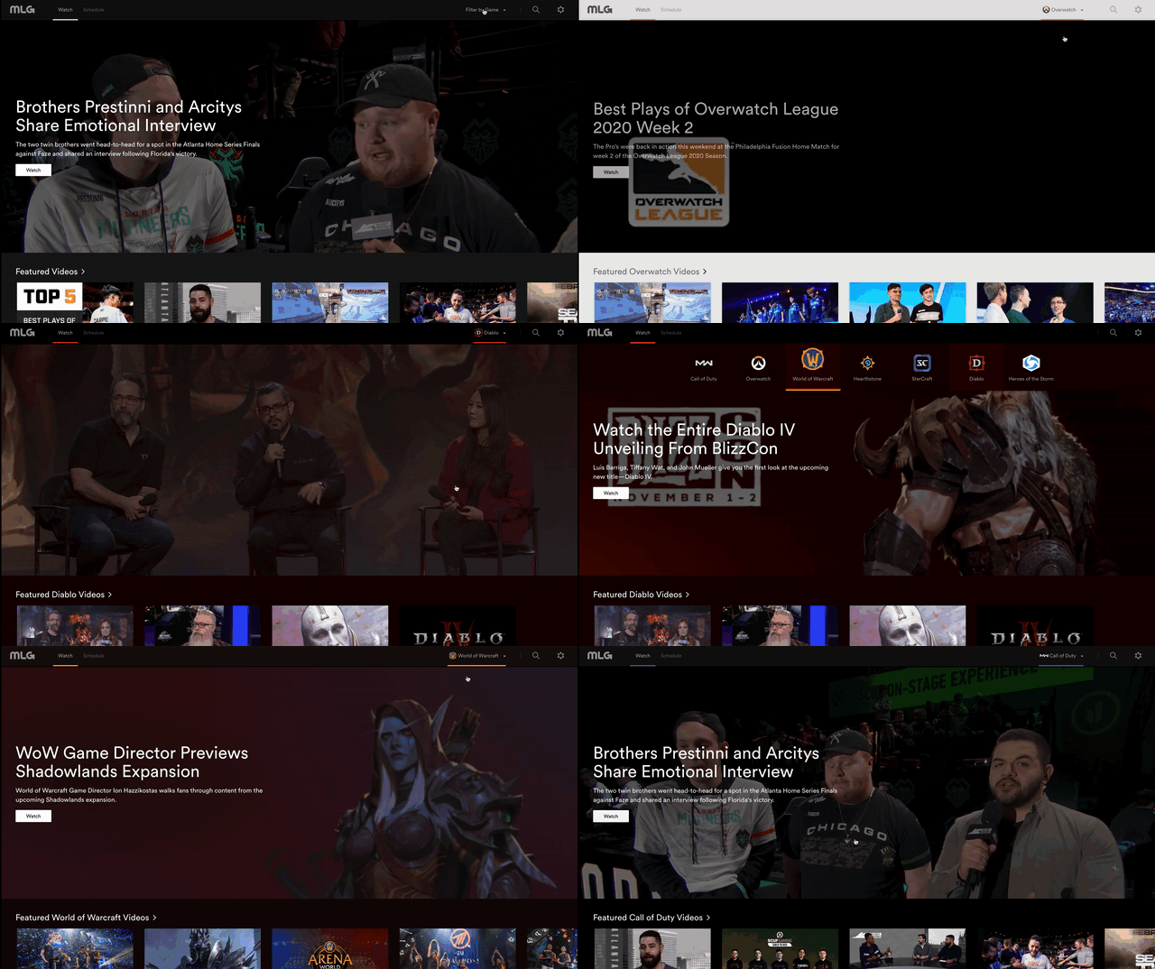
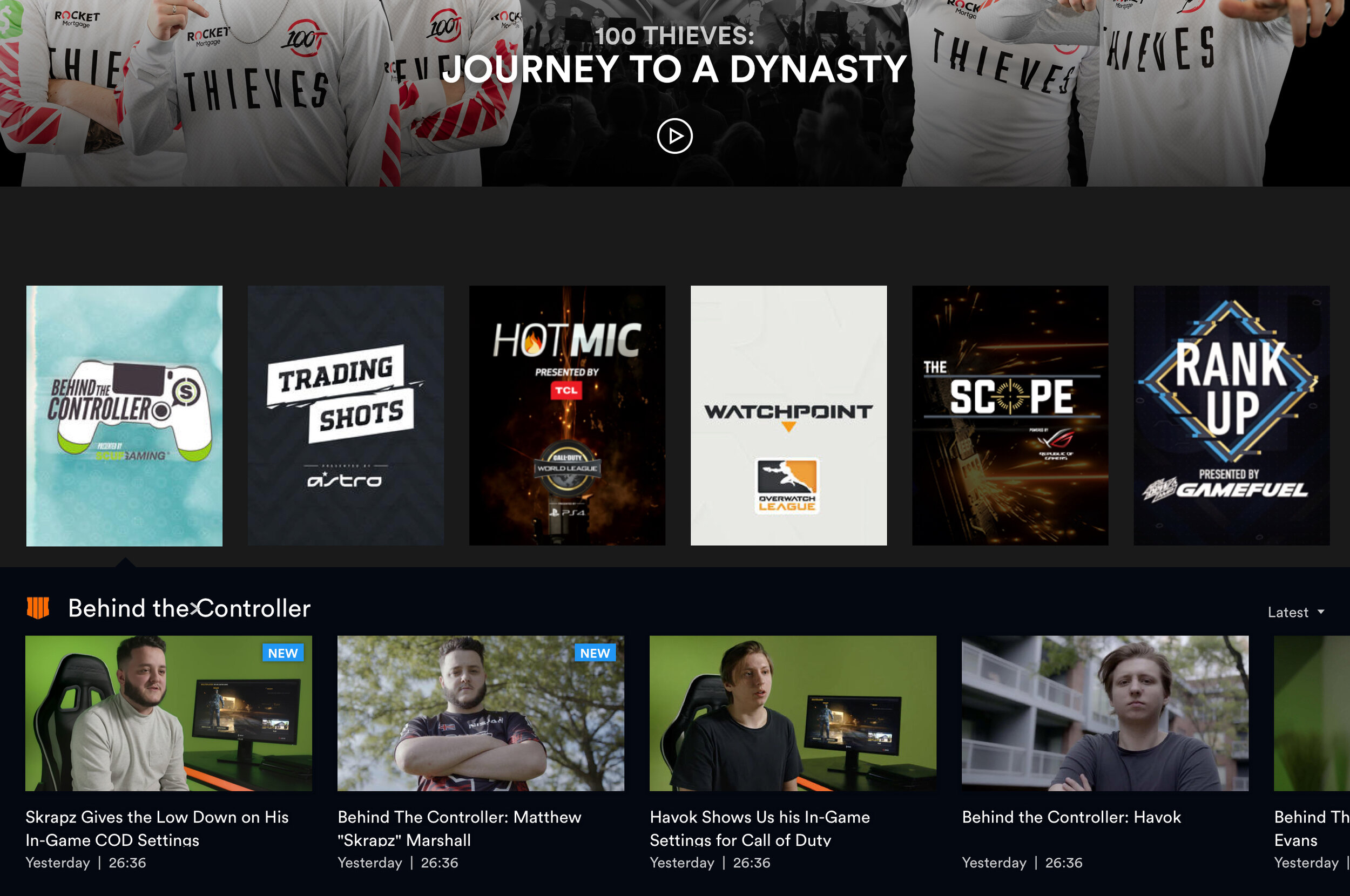
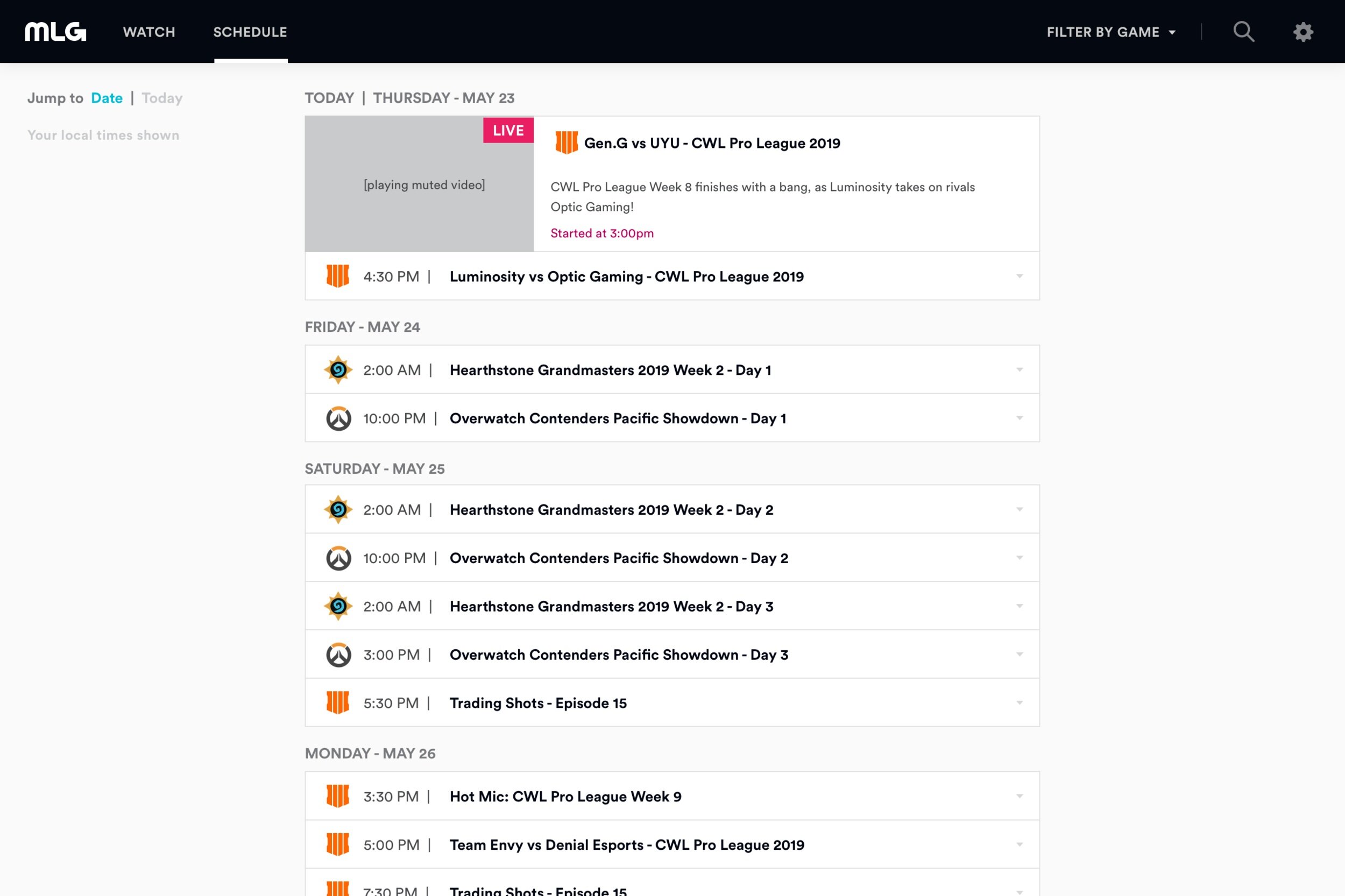
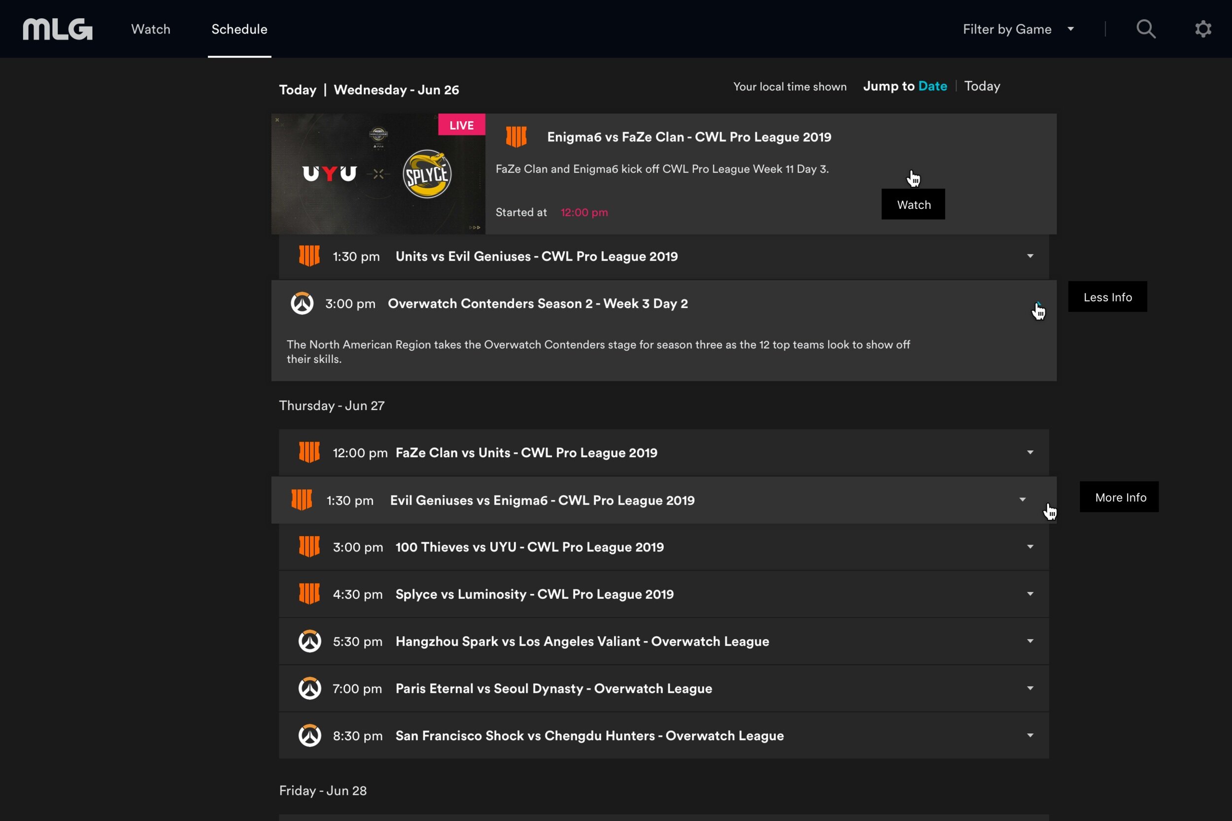
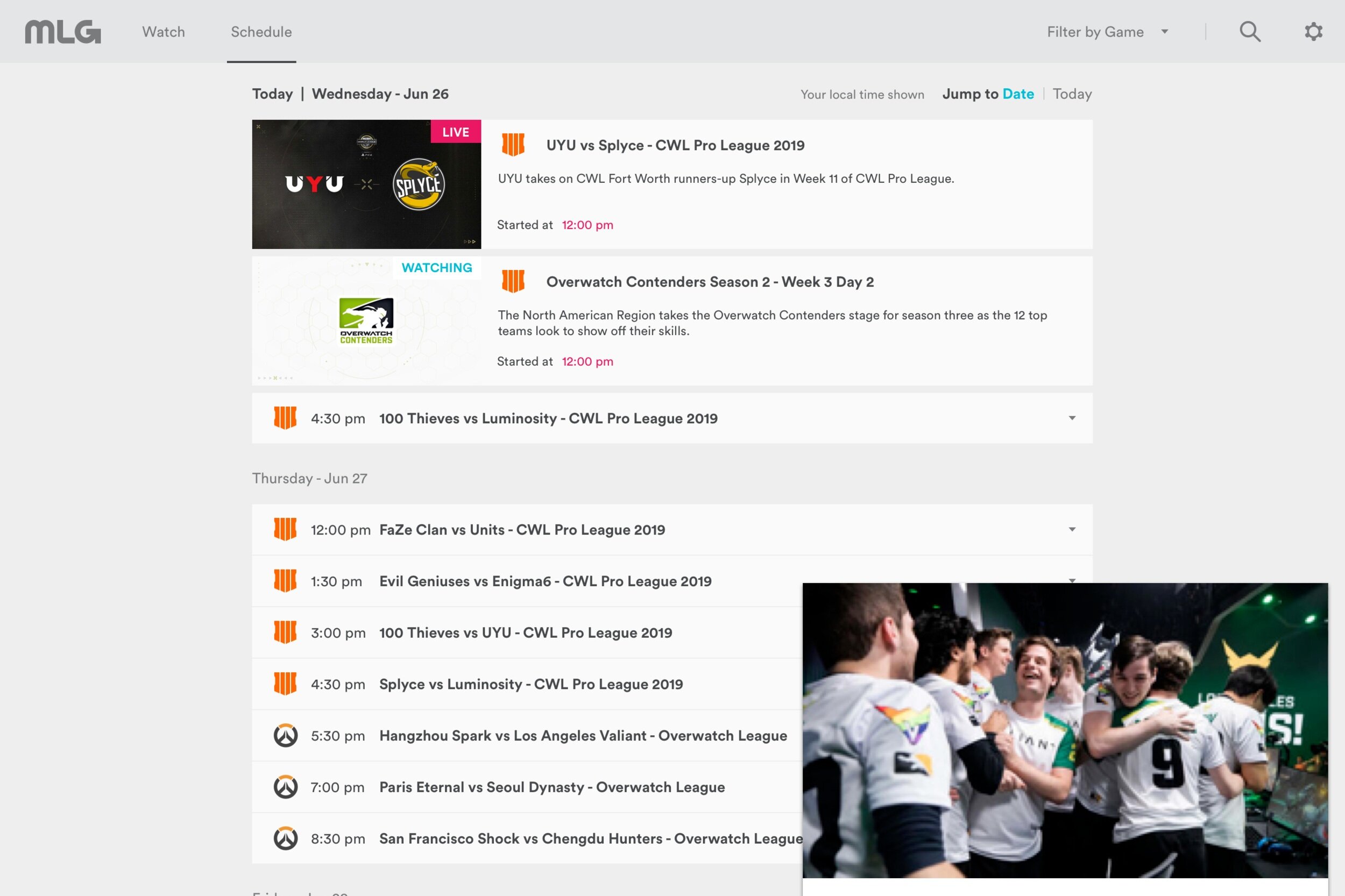
The MLG.com redesign coalesced around 3 main sections: the Watch page, the Schedule page and the Viewing Experience. Below is a sampling of wireframes and designs.
How did we deliver on our goals?
Build a foundation upon which we can iterate towards a deeper, more differentiated viewing experience.
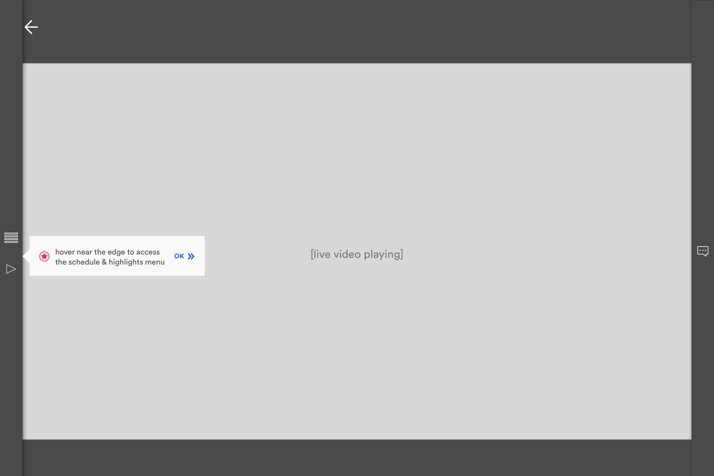
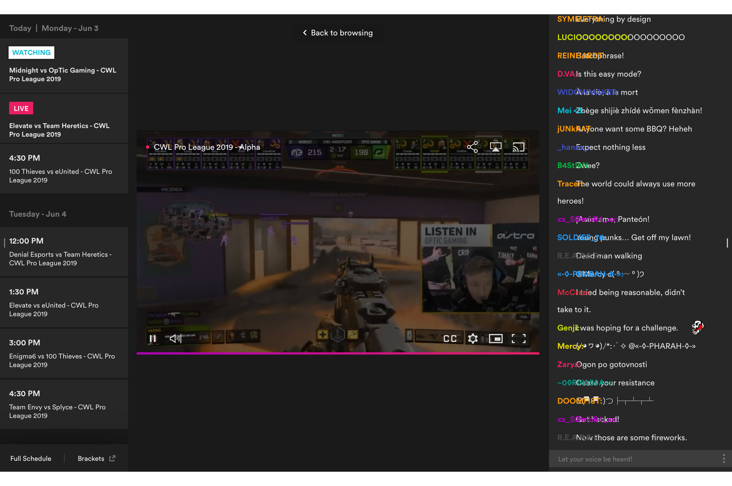
The left drawer in the live viewing experience holds highlights and the event schedule for phase 1. In later phases, that rail could also hold roster information, standings, merchandise etc. The model is that each left drawer section has a corresponding destination page so the viewer is able to immerse themselves in supporting information, keeping their video in the mini persistent player.
While the right edge holds chat for phase 1, in later phases that could become more personalized with direct messaging, games and rewards.
The modular Watch page is highly extensible and lends itself towards AB testing. As new data sources become available, and new promotional ideas come to mind, we can simply create a row to represent the idea and test it in product.
Increase viewer engagement: all paths lead to video.
The most critical touch points include the persistent player, the back to live breadcrumb (for when a user chooses to watch a highlight during the live stream) and live alert. As shown in the sitemap, there are few roads that do not point to video.
A Note on Visual QA
Product and design invested a lot of time in visual QA. We set up a JIRA board and ran weekly sessions doing the visual checks on staging and making notes on what was missing the mark. In many cases, we were able to get together with the developer in person and work through the discrepancies.
While this took a lot of time from the design team, it greatly improved the quality of the release. This also gave us something to improve upon for our next project - how might we decrease the time spent on visual QA while maintaining the front end quality?
Data & User Testing
Data: KPIs of 20% Lifts
Inconclusive due to two primary factors.
Unmatched promotion between beginning data and end data: Activision Blizzard partnered with YouTube as their exclusive streaming partner. While the YouTube player is integrated into MLG.com, all marketing and promotional communication drives to the YouTube platform. We lost our internal editorial and marketing resources last year. The viewership decline has made it difficult to draw comparisons.
Instrumentation cut from scope: Due to time constraints and losing additional resources, the instrumentation track for the redesign was cut drastically to only include video starts. The original instrumentation remained partly in tact, but the confidence in the accuracy of the data is very low.
Data: Tracking Effectiveness of Editorial “Special” Rows
Inconclusive due to lack of instrumentation. That said, we did bring this to user testing and received some good directional feedback.
User Testing: Desktop & Mobile During a Live Event
For this project, we ran user testing after our initial release, mostly due to resource and timing restrictions. Our test plan looked something like this:
8 candidates for 1 hour each recruited by Blizzard (gamers between 18 and 30)
Half the test on mobile and half the test on desktop, flip flopping which one goes first every other candidate
The test was around the main features of the site, especially the live viewing experience
Reaction questions sprinkled throughout to understand how the site was being received
Areas that Tested Well
Overall, highly usable. Filtering by game, finding a live stream or VOD, finding content that is interesting, finding the schedule all tested ‘effective’ to ‘very effective’. Users were able to complete 90% of tasks without much hesitation.
The look and feel felt “new” and “fresh” and like part of the game.
The homepage was highly scannable and the game icons were very helpful.
Mobile tested “even easier to use than desktop” in more than one test with half the testers indicating that they would be likely to use the site in the future.
Areas for Improvement
In the viewing experience, closing the left rail was not always intuitive. This was part of the First Time User Experience (FTUE) that was cut from scope in the implementation phase. Other treatments could also be explored and tested.
Special Rows were scanned over because they look similar to the ads. Would recommend testing different visuals, possibly “poster” sized with functionality like being able to expand a text overview.
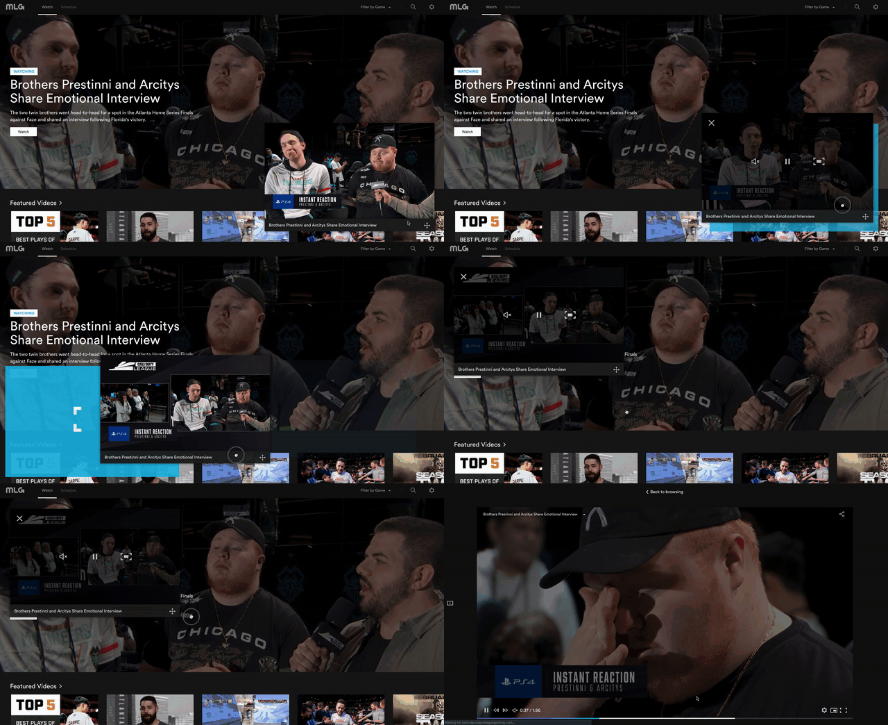
Being able to move the persistent player was not obvious unless the user was coached to see the handle icon shown on the title bar. Once users tried the feature, it tested high on the delightful and usable scale. Nice opportunity to improve discoverability here.
Additional features that users called out were actually closely aligned with features we had cut after the ideation phase. Many wanted to see personalized notifications, favoriting games and the viewership rewards “like on Twitch”. Almost every user called out something about being able to find more information about the players or the leagues. The content strategy and editorial lens could also use some work.
In general, users already had a place they went to watch this type of content - usually Twitch or YouTube. It was clear that motivating users to switch or add a new platform would be tough, especially for those who do not identify as esports fans.
REFLECTION
Communication is key. When we worked with open channels, raising hands to say where we were and what we were doing, things went more smoothly. When we went heads down without coming up to touch base, things got rocky.
Up front testing of concepts could have changed what we cut from phase 1, or at least let us queue up some early phase 2 work. Knowing that many users were interested in the roster concept, we could have put something small into the platform that tested this for Call of Duty League. Lack of early data affected our ability to better prioritize the feature set. Something for our design group to improve upon going forward.
The configuration of your team matters in how you set your expectations. The scope for engineering kept shifting every week and those growing pains were felt by our whole team. We didn’t always have the right people in the room, this was definitely a point to be improved upon for the next project.
Disorganization on one team is felt by all. For a few weeks, design was presenting work to engineering with little to no feedback. Once the tickets were cut, the feedback came pouring in. We worked to chop up our presentations into smaller and smaller pieces so as to get the feedback we were looking for earlier. In some cases, the team would end up presenting the same design over and over and over. If I were to do this project over again, I would have raised a red flag and gotten the leadership of each discipline together to sort out how to reset and organize instead of continuing to push through what was not working. We probably could have saved instrumentation from being cut had I addressed these pain points head on.
Thank you to the design team members.


